A piece of furniture can’t talk. It can’t explain its craftsmanship, comfort, or style. But a good photograph can. In the age of online shopping, one image often replaces a showroom. The lighting, angle, and mood of a photo shape a customer’s perception faster than any product description ever could.
Furniture photography sits at the intersection of utility and emotion. It must communicate dimensions and materials clearly while also inspiring a sense of space, lifestyle, or aspiration. A well-shot image can convert a casual scroll into a committed purchase, boost brand authority, or give life to a static catalog.
This article breaks down the process of great furniture photography into practical steps. It’s not about gear hoarding or technical jargon—it’s about decisions: what to show, how to light it, how to style the space, and what mistakes to avoid. Whether you’re photographing a single heirloom chair or an entire showroom line, these tips will help you get better results with what you already have—or point you toward what’s worth investing in.
We’ll start with mindset—how to think before you shoot. Then we’ll walk through lighting techniques, styling the space, choosing the right angles, editing wisely, and recognizing common pitfalls that can sabotage even your best efforts.
The Furniture Whisperer’s Mindset
Before touching a camera, decide what the photo is meant to say. Is the goal to highlight the craftsmanship of a chair? Show how a couch fits into a cozy living room? Make a product page look more polished?
Customers don’t see objects—they see potential. They imagine how that piece fits into their life. A good photo anticipates that. The mindset shift is simple but powerful: Don’t shoot for documentation. Shoot for emotion.
Decide the message. Is it about softness, strength, luxury, minimalism? That intention should guide every visual choice from lighting to props.
Photography for mood leans on wider angles, warm lighting, and soft shadows. Photography for product detail requires close-ups, sharper contrast, and clarity in materials. Don’t try to do both in one shot—break the shoot into sets. For instance, a hero image might show the product styled in a room, while a few side shots focus on joinery, textures, or scale.
Also consider the shopper’s headspace. A customer browsing restaurant furniture wants cues about durability and finish more than plushness or coziness. A shopper for a reading chair might care more about mood and comfort than dimensions.
Good furniture photography starts not with a camera, but with the right questions: Who is this photo for? What will they use it for? And how do I visually support that need?
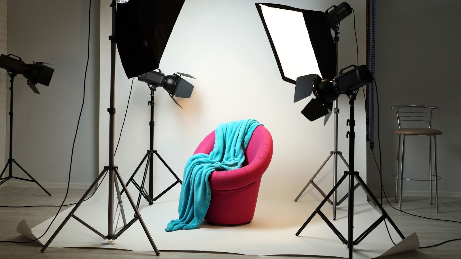
Light Before Lens – Mastering Natural and Artificial Light
No setting, prop, or camera can fix bad lighting. It defines the mood, reveals material texture, and creates visual depth. Without proper light, even the most beautiful piece of furniture looks flat or harsh.
Natural light is your best first tool. Window light—especially from the side—adds soft shadows that create shape. Avoid direct overhead light or mid-day sun. The best time to shoot indoors is during the golden hours: early morning or late afternoon when the sun is low and warm.
Use bounce boards to reflect light into darker corners. A white foam board or wall can reduce shadows without adding extra lights. Reflectors help keep fabrics like velvet or suede from going muddy in low contrast.
If natural light isn’t enough, add softboxes or LED panels with adjustable temperature. Match the light temperature to daylight (typically 5000–5500K) for a consistent, clean look. Mixing warm and cool light sources can create color casts that are hard to fix later.
Backlighting works for translucent materials like glass or plastic, but use it sparingly. Front-lighting can flatten texture unless angled slightly. The goal is to create directional light—not just brightness.
Finally, turn off overhead ceiling lights unless they’re part of the look. They often cast harsh shadows and give off inconsistent hues. Instead, rely on side lighting to sculpt the form of the furniture without blowing out highlights.
The key to great lighting is not brightness, but control. Light should define, not overwhelm.
Styling the Scene Without Stealing the Spotlight
A chair in an empty white room can feel sterile. A couch surrounded by mismatched props can feel chaotic. Styling should complement the furniture—not compete with it.
Start with the story. A rustic coffee table benefits from a stack of aged books and a textured throw. A minimalist desk looks better with nothing but a single laptop and a plant. Every prop should reinforce the product’s purpose or mood.
Stick to a limited palette. If your furniture is a bold color, use neutral surroundings. If the piece is subtle in tone, add one or two elements of contrast to draw attention. Avoid over-matching, which can make the image look washed out.
Use negative space. Don’t fill every part of the frame. Open areas help the eye focus on what matters. The space around the product is just as important as the objects within it.
Be careful with proportions. A huge floor lamp next to a low-profile couch can distort the viewer’s sense of scale. Use objects of similar size or adjust camera height to balance proportions.
Anchor the piece in context. Show a couch on a rug, a dining table with a setting, or a bed against a styled wall. This doesn’t mean recreating a full room—it means suggesting one. That’s often enough to help a viewer imagine how the furniture fits into their own home.
When working with restaurant furniture, styling choices should reinforce durability, hygiene, and space optimization. Clean table surfaces, polished seating, and deliberate spacing help buyers visualize usage in a commercial setting.
Angles That Sell – Framing, Composition, and Perspective
A good photo feels effortless—but it’s the result of deliberate framing.
Start with height. Shooting from eye-level can distort furniture meant to be seen from seated height. Waist-level often gives the most accurate sense of proportion. Try both and compare.
Use a tripod to maintain consistency. This prevents subtle tilts and helps you fine-tune angles instead of re-framing every time.
Follow the rule of thirds: place your subject one-third from the edge of the frame rather than dead center. This creates balance and guides the eye.
Leading lines—like rugs, floorboards, or edges—can draw attention to the product. Align them carefully so they don’t tilt awkwardly or cut off the subject.
Symmetry can work well for classic or formal pieces. For more casual or lifestyle-focused shots, asymmetry often feels more natural.
Show function. If a piece has moving parts, photograph it both open and closed. A recliner, extendable table, or modular shelf makes more sense when its flexibility is visible.
Texture matters. Zoom in to show the difference between matte and gloss, wood grain and smooth laminate, or coarse and fine fabric. These close-ups are essential for online buyers who can’t touch the product.
Mind the background. A crooked wall outlet or messy shelf in the corner can distract from even the best framing. Take the time to declutter or recompose.
Perspective should feel natural—not warped. Avoid wide-angle lenses unless the room is small and you absolutely need the breadth. They can distort furniture legs or stretch surfaces unnaturally.
The Essential Gear List
You don’t need a studio or top-tier DSLR to get professional results. What matters more is how you use what you have.
Cameras and Lenses
For serious work, an entry-level DSLR or mirrorless camera like the Canon EOS R50 or Sony ZV-E10 works well. Pair it with a 24mm or 35mm prime lens for full-room shots, and a 50mm or 85mm for details.
Tripods
A stable tripod with a ball head lets you compose clean shots without blur. Even cheap models improve sharpness in low light.
Lighting Accessories
A softbox kit, even a budget set, can elevate indoor shots dramatically. Pair them with daylight bulbs or LED panels at 5500K.
Reflectors and Bounce Boards
Use a basic 5-in-1 reflector for shaping light. Or create your own bounce board from white cardboard.
Smartphones
Modern smartphones can shoot excellent photos if you use manual mode. Apps like Halide (iOS) or ProCamera (Android) let you control focus, ISO, and white balance. Use a phone tripod and shoot in RAW if possible.
Editing Software
Even free apps like Snapseed can handle most adjustments. Adobe Lightroom (mobile or desktop) offers powerful controls and easy batch editing.
Start with what you have, and upgrade as your needs (and results) grow.
Editing That Enhances, Not Misleads
Post-processing refines what the camera captures. It shouldn’t deceive—just clarify.
Start with basic corrections:
- White balance: Match reality. Furniture lit with warm light shouldn’t look blue.
- Lens correction: Fix warping from wide-angle lenses.
- Sharpness and clarity: Subtle increases help define texture but avoid overdoing it.
Remove distractions. Use a spot-removal tool to eliminate cords, tags, or wall marks. But don’t edit out features that matter—scratches, seams, or finishes should remain true to the product.
Color grading can set mood but shouldn’t change product appearance. If the wood is walnut, don’t make it look like oak. If the velvet is gray, don’t warm it into taupe. Maintain truth in hue and tone.
Use presets sparingly. They’re great for creating consistency, especially in a product catalog. But what works for one fabric may wash out another. Manual adjustments often yield better fidelity.
Export in high resolution. JPEGs at 80–90% quality and 300 DPI are ideal for print. For web, compress smartly without sacrificing clarity—tools like TinyJPG help balance file size and sharpness.
Editing should serve the photo—not rewrite it. A viewer’s trust depends on what they see being what they get.
Common Mistakes That Ruin Great Furniture Shots
Even good gear and intention can’t save you from common traps.
Cluttered Composition
Too many props or misaligned decor can pull attention from the piece. Ask yourself: does every item in the frame support the furniture, or distract from it?
Mismatched Light Temperatures
Mixing natural daylight with warm ceiling bulbs creates inconsistent color. Always match your light sources or eliminate one type entirely.
Reflections and Glare
Glossy surfaces often reflect windows, you, or the tripod. Check your angles before shooting and adjust lighting to reduce hotspots.
Poor Scale Representation
Shooting too close with wide lenses makes furniture look larger than it is. Too far, and you lose detail. Use side-by-side props or people (with consent) to offer scale cues if needed.
Editing Overkill
Oversaturation, fake shadows, or heavy vignettes can mislead buyers. Subtlety preserves believability.
Crooked Lines
Horizon lines, walls, or legs that appear tilted signal carelessness. Use a grid or level in your viewfinder.
Even seasoned photographers miss these details. Take time to review your shots between setups. A five-second fix can save an entire campaign.
The Craft, Not Just the Click
Great furniture photography isn’t about expensive equipment or trendy presets. It’s about control, intent, and an understanding of how people connect with space and object.
Every piece tells a story. Your job is to help it speak through images. Whether it’s a plush reading chair in natural morning light or industrial furniture staged for a catalog, each setup needs a purpose.
Avoid shortcuts. Prep the space. Light carefully. Shoot with structure. Edit honestly.
One strong photo can elevate a listing, close a deal, or build a brand. But it happens when you think like a designer, shoot like a storyteller, and care like a craftsman.
Let your photography say not just, “This is what it looks like,” but “This is how it feels to live with.”